Blending Tile Floors with Other Tile Features
When you know how to work other tile elements into your designs, you too can successfully combine tile flooring with other tile elements to always achieve a positive outcome. Whether you aim to achieve a streamlined, monochromatic look or something more adventurous, read on for tips on mixing different tile sizes, shapes, finishes, textures, and colors.
Choose Larger Tile for Floors
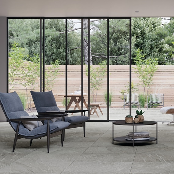
A floor's tile size affects the overall design of a room, and the larger the space, the larger the floor's format. But even in a small room, using the largest tile that is still appropriate for the application means fewer grout lines, and results in fewer visual interruptions.
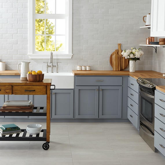
As for other tiled surfaces in the room, use a mix of small or midsize tiles to create visual interest and add scale to the room. For example, although a large floor area can handle supersized tiles, mosaic or small square tiles are most likely the best choice for a kitchen backsplash. Conversely, using large-format tile or slab products can create a fluid effect that plays into a minimalist or ultramodern setting.
Mix Basic and Complex Shapes
Squares and rectangles are the most common floor tile shapes, but there are lots of linear and plank products that offer long, short, wide, and narrow dimensions on the market too. Using rectangular tile on floors can make small rooms appear larger than they really are, and when you continue the tile up the wall vertically, it can make the ceiling appear higher as well.
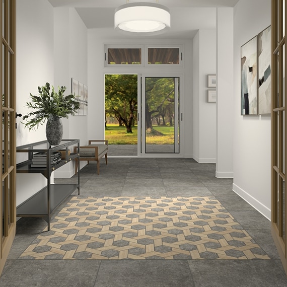
The humble, basic square often takes a back seat to other competing tile shapes in the same space. Therefore, by opting for a square tile floor, you allow for a dynamic complementary design, such as a herringbone or basket weave pattern on an accent wall or backsplash. Keep in mind that if you incorporate a busy design into a room, you should keep the rest of the space simple. In a kitchen, for instance, counter a vibrant mosaic backsplash by wrapping the island in simple white marble or granite that matches the countertops.
To use different types of tile floors in adjoining rooms, go with distinctly different shapes, such as wide wood-look planks to offset glazed porcelain squares. Alternatively, you can use the same tile in a different direction, such as by turning a square kitchen tile diagonally, for an adjoining living space. With either of these options, you can create the idea of separation, and form well-defined areas, which are especially important in an open-concept structure.
Combination of Finishes
Sheen isn't just about dull and shiny surfaces, it's also about light reflection. In some cases, the more bounced light, the better. For example, a design touting old-Hollywood glam would benefit from as much sparkle as possible. In this scenario, a mix of polished marble floors with glass or metal wall tiles can create a luxurious, shimmering ambiance. On the other hand, if you're looking to create a more muted look, balance matte and shine by using natural stone or wood-look tile floors to ground a room's shiny marble counters or stainless and gunmetal backsplash.Keep Textures in Mind
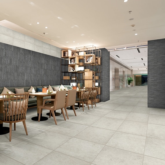
A balanced home is rich in texture. Texture adds definition and keeps your home from appearing flat or monotonous. Of course, texture comes in many forms, from plush sofas to nubby rugs, but even before furniture and accessories are added, a room can offer an array of textures with its fixtures and finishes. For example, textured glazed porcelain tile brings a rugged touch to its surroundings, while glass mosaics offer timeless charm. Textured porcelain flooring is an ideal anchor for an entryway or washroom, and it can be balanced with a wall of sleek, smooth glass, ceramic, or metallic tile.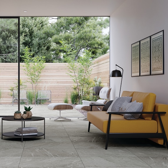
Go with Neutral Colors and Bold Accents
Alternatively, if you're designing a futuristic or trendy space, no need to shy away from using a power color. For instance, if you're installing bold tile hues on a wall, such as a striking blue glass mosaic, surround it with complementary browns or wood tones and white, chrome, and metallic elements. This keeps the neutral colors from overpowering the design.
Blend Solid and Patterned Materials
The natural or nature-inspired patterns in tile such as veining, flecks, and grain contribute to a room's visual stimulation and movement. While some appear to resemble waves, or have a wood-grain patterns, and others feature a subtle concrete effect. If patterns are too similar, they can create an overstimulating or visually busy space, so how you mix them is more important than you realize.
A mix of solids and patterns on surrounding surfaces can offer balance and form, but before you begin, create a successful design storyboard by blending tile and slab samples in complementary patterns. For example, try pairing a concrete tile floor sample with more vivid materials such as natural stone or wood-look tile. Even a minimalist space can benefit from a mix of solids and patterns, especially when the colors blend seamlessly from one to the next.
Don't Forget about Grout
Although it may seem insubstantial, grout is a key player when creating a superior design. Dark grout, for example, outlines pale wall or floor tiles, making their shape stand out, which is essential if your goal is a dramatic geometric presence. If you're working on a monochromatic or minimalist design, however, you should closely match the grout with the tile color for a less pronounced, more fluid look.Grout width is important, too. The wider the grout lines, the more rustic the result. This means that generous grout lines are ideal for the country, traditional, European, or old-world design, so consider going with thicker lines between terra-cotta or travertine tiles. Narrow lines, on the other hand, reduce visual interruptions and improve transitions for a clean, streamlined look that boasts a modern vibe and is more suitable for a contemporary space.


